A UX Case Study
Leveraging AI to facilitate mental health via a HIPAA compliant digital platform
Project Roles
UX Design
UI Design
UX Research
Developer Handoff
About the product
The platform utilizes AI technology and advanced data analytics to provide personalized mental health support tailored to individual needs. By integrating AI with care, it ensures therapy seamlessly fits into daily life, optimizing every interaction like journalling, mood logging and AI summaries. It is hoped to transform the landscape of mental health care.
Why did they require a change in design?
The decision to update the design was simple. Launch date was coming soon and the current state of the interface was out dated. Moreover, beta testing had surfaced several usability issues that needed to be fixed.
Goals and Objectives
The main goals of the project were to give an enhanced usabilty, a smooth flowing modernized look and expereience and keep it HIPAA compliant.
On to the fun bits then.

So who's the user? What do they want?
Through our research, we identified two primary user personas.
The first persona represents the clients who are seeking mental health support. These users prioritize ease of access to resources, personalized care, and a seamless user experience. They value privacy and confidentiality, which is why maintaining HIPAA compliance is crucial.
The second persona focuses on practitioners and partners who use the platform to provide services. They require efficient tools for managing client interactions, scheduling, and accessing client data securely.
Feedback from beta testers highlighted the need for intuitive navigation and clear communication channels, which we incorporated into the personas to ensure the platform meets the diverse needs of all users.

What are the others doing?
The industry is vast, and the competition is intense. However, this presents an opportunity to learn and draw inspiration. I conducted an in-depth analysis of our competitors' product designs, user flows and journeys, and customer retention strategies. By identifying their strengths and areas for improvement, I discovered ways to make our product stand out and provide an exceptional experience for visitors.


Heuristic Analysis of existing product
Given the extended timeline for design and development, we decided to address the usability issues in the current product first to ensure a timely launch.
A heuristic evaluation identified 26 usability and user experience issues, which were promptly resolved and communicated to the development team via tickets to fix.
A heuristic evaluation identified 26 usability and user experience issues, which were promptly resolved and communicated to the development team via tickets to fix.


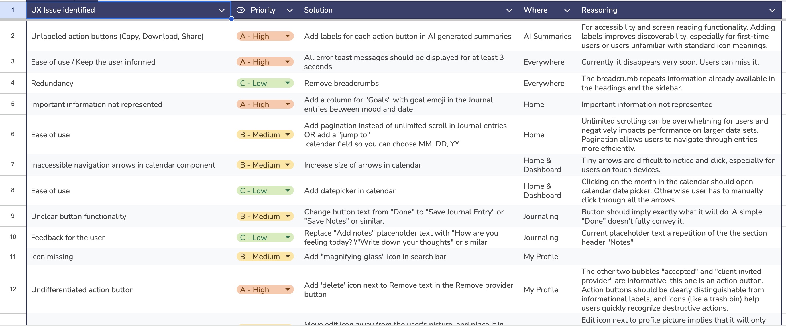
Major problems I discovered in the current product:
1. Inaccessible and outdated user interace
The existing user interface was not accessible or following WCAG guidelines, designed like it was in 2010, and was breaking key design principles.
2. Application Structure
Dashboard logic, and the app structure did not make logical sense.
3. The interface was not fully HIPPA compliant
Missing privacy pages and links, ability to delete account not visible, among others.
4. The user needed a gamification element
Stuff like daily streaks and mood goals to keep the user engaged
Let's do some card sorting...
I got together with the product stakeholders, some users, and a few folks from the company for a card sorting session. This helped us figure out the best way to organize the product's structure and logic. By seeing how different people grouped and navigated information, we spotted patterns and preferences that guided us in redesigning the user interface to be more intuitive and user-friendly.

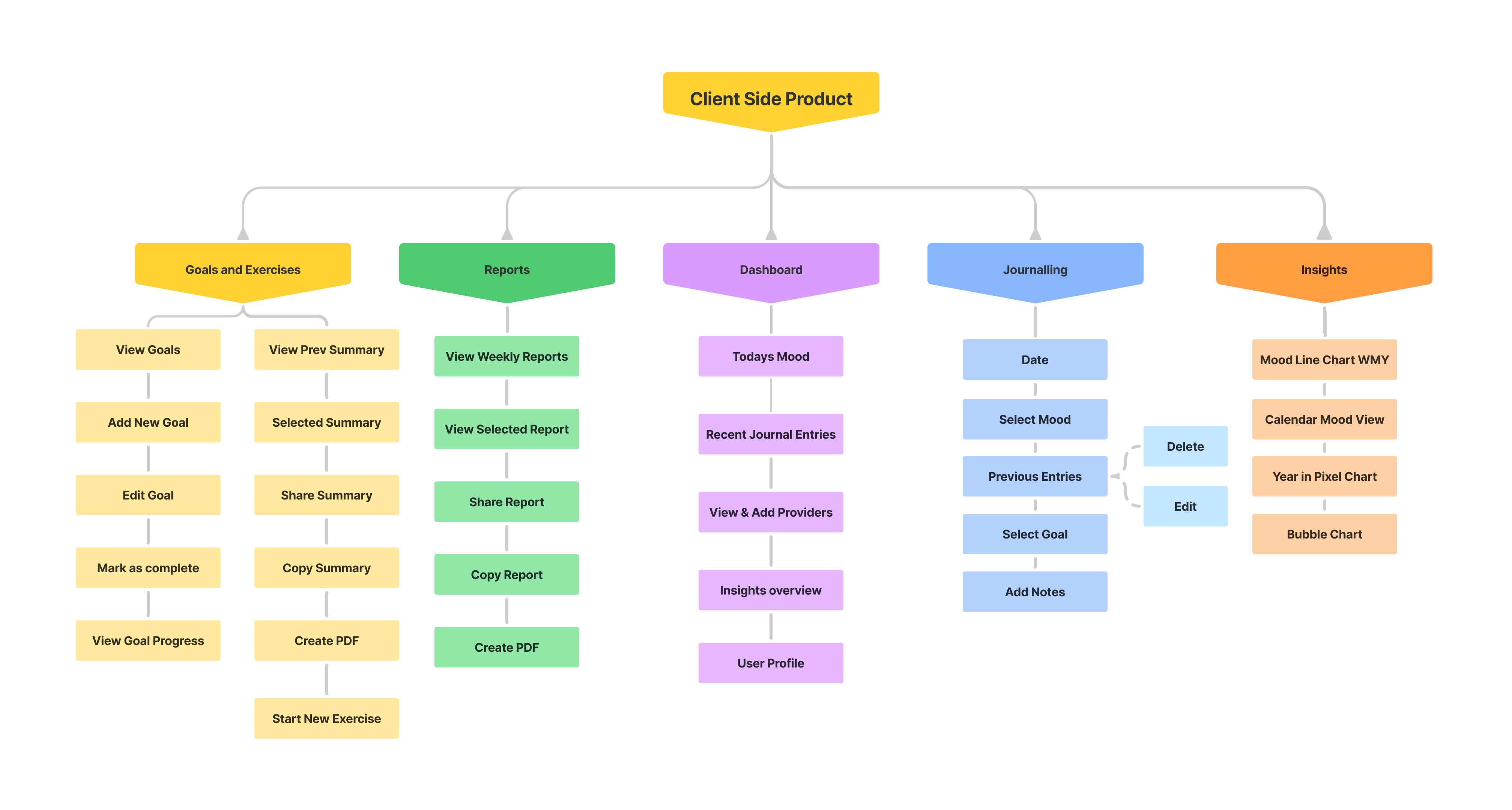
...and create an Information Architecture.
Using insights from the card sorting session, I created an information architecture that prioritized user needs and logical flow. This architecture served as a blueprint for the redesign, ensuring that every element was strategically placed to enhance usability and accessibility.
Sneak peak into my journal ;)
I kicked design off by sketching and jotting down ideas for each page, keep the user and business goals in mind. I focused on features that would be easy to use and layouts that just made sense. I scribbled down notes on design elements to make sure they matched what we were aiming for and what users needed. This part was super important for mapping out the user journey and spotting key interaction points.

.png)


..which paved the way towards digital wireframing and finalzing page layout and strucures.


Some UI Moodboarding...

and finally, Hi Fidelity design.
Light Mode


.png)


Dark Mode


.png)


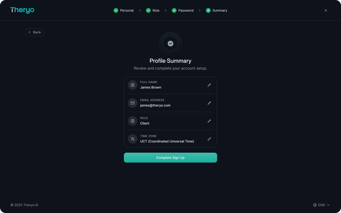

Based on the wireframes, information architecture, and user flows, a high-fidelity design was crafted. This resulted in a sleek, modern dashboard that provides users with all necessary information at a glance. The design is both WCAG and HIPAA compliant, ensuring accessibility. Additionally, both light and dark modes were designed to cater to user preferences and accessiblity.
Mockups

Developer Handoff
The developer handoff was managed through tickets raised on the Gleap Board, providing developers with access to Figma files in Dev Mode. Comments were added to explain the interface and component properties where necessary. Additionally, a handoff call was conducted with the developers to clarify all aspects. A zip file containing created assets was also provided for a smooth transition.
