A UX Case Study
How UX research and iterative testing shaped a platform for international student's uni applications
Project Roles
UI/UX Design
Prototyping
UX Research
Usability Testing
About Glint.
Glint is a research-driven digital platform designed to support international students navigating the complex process of applying to universities in Germany.
Acting as a personalized education counselor, Glint combines guided onboarding, a smart application tracker, and an AI-powered chatbot to simplify exploration, decision-making, and document management.
Built by and for international students, the platform is grounded in extensive user research, usability testing, and iterative design to ensure it’s not only functional but truly empathetic to the challenges students face.
Phase 1: Empathize & Research
What was the problem?
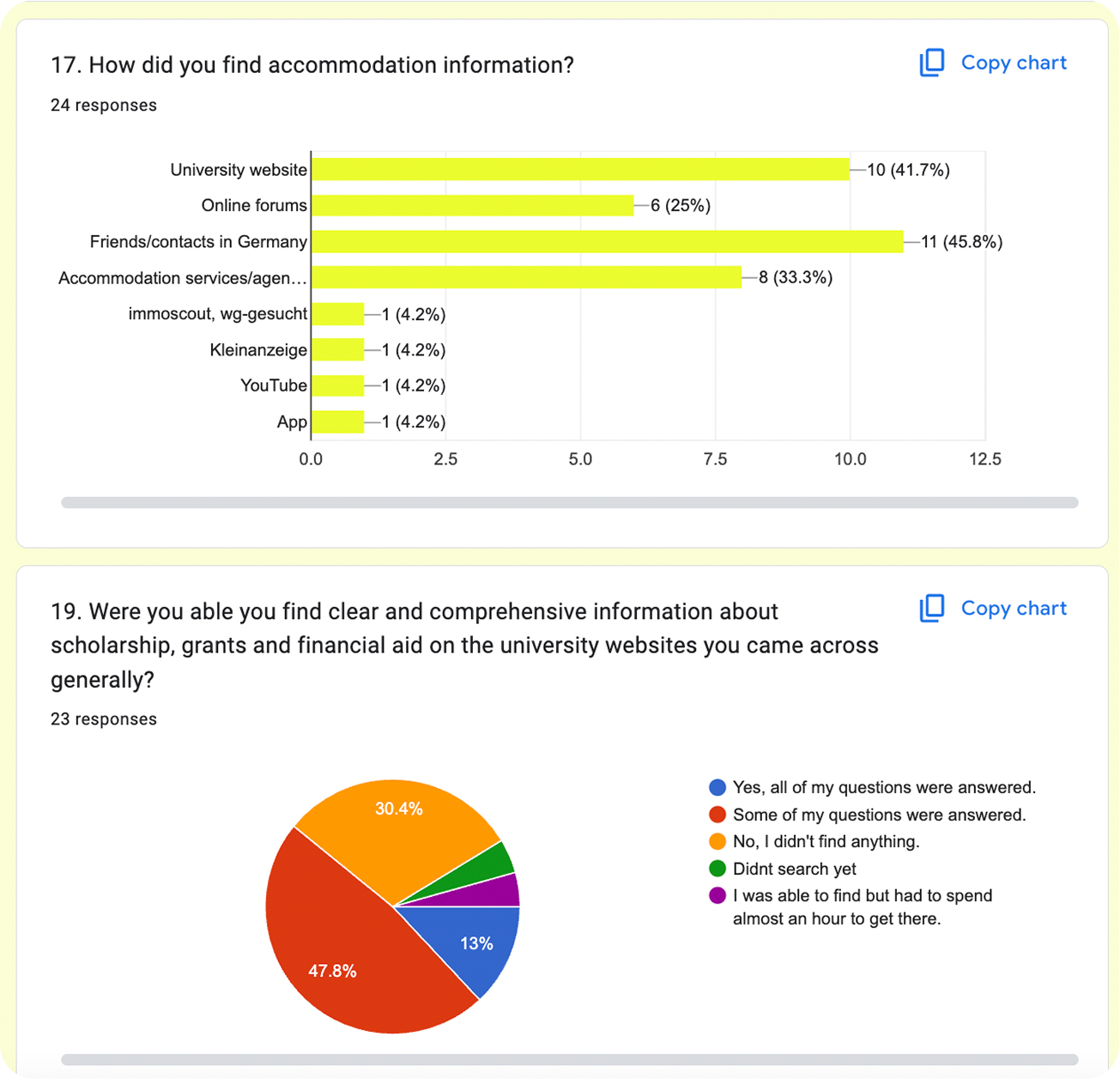
Germany has become an attractive destination for higher education, but for many international students, the application journey feels like a maze of fragmented websites, conflicting information, and bureaucratic hurdles. As international students ourselves, we experienced:
- Inconsistent program details across platforms
- Unclear visa and legal processes
- Language barriers and overwhelming terminology
- A lack of step-by-step support and community guidance
We believed there had to be a better way: a solution that feels like a digital guidance counselor, always available, always clear.
Existing solutions:
DAAD.DE:
www.daad.de
User-friendly but outdated layout. Offers extensive information on life in Germany and visa processes. Official and authorized with strong search capabilities, but can be overwhelming. Unique alumni section, though limited to alumni only.
www.daad.de
User-friendly but outdated layout. Offers extensive information on life in Germany and visa processes. Official and authorized with strong search capabilities, but can be overwhelming. Unique alumni section, though limited to alumni only.

Uni-Assist.de
www.uni-assist.de
The layout is somewhat disorganized, impacting usability. It offers a straightforward application process with guidance on admission criteria and document requirements. The site also emphasizes preparatory courses for language and education, but the search functionality is average.

My German University
www.mygermanuniversity.com
Offers a modern UI with extensive search features and weekly webinars on topics like scholarships and visas. It provides comprehensive articles and blogs, though the abundance of information can be overwhelming.
www.mygermanuniversity.com
Offers a modern UI with extensive search features and weekly webinars on topics like scholarships and visas. It provides comprehensive articles and blogs, though the abundance of information can be overwhelming.

Approaching the research:
To validate and deeply understand this problem, we:
- Reviewed 5 existing solutions and competiros
- Collected 50+ responses via various Google Forms
- Conducted 15 detailed interviews with students from 8 countries
- Held two moderated focus groups
This helped us understand not only the functional blockers, but the emotional burden students faced: uncertainty, anxiety, and isolation.


Phase 2: Define & Synthesize
User Personas
We developed three comprehensive personas to capture the diverse needs and challenges of our target users:
1. Niloofar, an MSc applicant in AI from Iran, who is tech-savvy but struggles with language barriers and visa complexities.
2. Imran, a BSc aspirant in Mechatronics from Pakistan, who is enthusiastic about studying abroad but finds the application process daunting due to inconsistent information.
3. Alia, a PhD aspirant in Biotechnology from India, who is well-versed in academic research but needs guidance on navigating the bureaucratic hurdles of international education.


Scenario Mapping
We mapped worst-case vs. best-case journeys. For example:
Without Glint: Sarah scrolls endlessly through outdated pages and misses deadlines.
With Glint: Sarah sets up her profile, gets matched to programs, receives visa guidance, and tracks
everything via the dashboard.
Journey map of Sarah's worst-case vs best-case flow
Without Glint: Sarah scrolls endlessly through outdated pages and misses deadlines.
With Glint: Sarah sets up her profile, gets matched to programs, receives visa guidance, and tracks
everything via the dashboard.
Journey map of Sarah's worst-case vs best-case flow
Task Analysis
Glint needed to simplify complexity, not add to it. Through our task analysis, we identified five key design needs:
- Simplify tasks like applying, tracking, and searching
- Clarify steps with clear progress indicators
- Personalize support based on user context
- Ensure real-time feedback via chatbot and tracker
- Foster engagement through well-moderated community tools
To ensure Glint addressed real user actions and didn’t overcomplicate workflows, we mapped out the key tasks a user would perform on the platform. Each task was analyzed from the perspective of goal, steps, user role, and possible challenges.
Task 1: Profile Setup
Goal: Gather user background to personalize experience:
- Sign up and initiate onboarding
- Answer optional questions on education, goals, and interests
- Upload CV and select tags
User role: Active input provider
Challenges: Overwhelm from too many questions, hesitance about sharing personal data
Goal: Gather user background to personalize experience:
- Sign up and initiate onboarding
- Answer optional questions on education, goals, and interests
- Upload CV and select tags
User role: Active input provider
Challenges: Overwhelm from too many questions, hesitance about sharing personal data
Task 2: Explore Programs
Goal: Find universities and degrees relevant to user's profile:
- Use filters (language, location, fees, degree type)
- View program cards and compare
- Save programs to shortlist
User role: Searcher and decision-maker
Challenges: Too many filters, filter logic misunderstandings, information overload
Task 3: Track Applications
Goal: Monitor progress across multiple applications:
- Add programs manually or from explore view
- Update statuses (e.g., researching, applied, accepted)
- Receive reminders via calendar integration
User role: Organizer
Challenges: Forgetting to update, unclear status meanings, missed deadlines
Goal: Monitor progress across multiple applications:
- Add programs manually or from explore view
- Update statuses (e.g., researching, applied, accepted)
- Receive reminders via calendar integration
User role: Organizer
Challenges: Forgetting to update, unclear status meanings, missed deadlines
Task 4: Use AI Chatbot
Goal: Get answers to procedural and university-related questions:
- Ask or select prompts about programs, documents, deadlines
- Receive personalized responses based on profile
User role: Information seeker
Challenges: Misunderstanding input types, expectation of human-like conversation, unrecognized questions
Phase 3: Ideate, Design, Test
From Insights to Interface
Using our research, we sketched, structured, and prioritized the core functionality:
- A dashboard-first approach to centralize the experience
- A program explorer with compatibility filters
- A chatbot named Orion to provide contextual, real-time guidance
- An application tracker to follow every application milestone
We started witn paper sketching for ideation and concept validation


and after that...
We returned to our focus groups to validate our early designs. A key insight was the need for a friendlier, more human experience: something less robotic and easier to use. Participants shared that having an education counselor and a way to track their applications made a big difference in their application journey, while those without support often felt lost.
This led us to reframe Glint as a personal digital counselor. A platform that guides users through their university applications with empathy, personalization, and AI-driven support.
From that point on, our goal was clear: to bridge the gap between guided and unguided students by offering real-time advice, tailored recommendations, application tracking, and a warm, branded experience led by our chatbot mascot, Orion.
Which led to us creating low-fidelity wireframes and prototyping them using Figma...


...and we testing them for usability with 13 test participants from the target demographic.

To evaluate the prototype’s effectiveness, we conducted usability testing using a combination of methods: the Wizard of Oz technique to simulate chatbot responses, the Think-Aloud method for real-time user feedback, and interactive Figma prototype sessions lasting around 30 minutes.
Our goal was to uncover how users navigated the platform, used the features, understood the process, and reacted to the guidance provided.
1. Profile Setup
Scenario:
Users were asked to imagine themselves as international students creating a profile to receive personalized university recommendations.
Task Flow:
- Begin onboarding and proceed through multiple profile questions
- Navigate using Next, Back, and Skip buttons
- Choose between multiple-choice and open-ended inputs
- Complete the setup and view a confirmation or welcome message
Journey:
This flow simulated the first-time experience of onboarding, aiming to gather enough user context for tailored recommendations and future platform personalization.
2. Chatbot (Orion)
Scenario:
A student from Pakistan uses the chatbot to simplify their search for German Master's programs in Design.
Task Flow:
- Locate and launch the “Ask Orion” chatbot from the dashboard
- Read onboarding instructions and example prompts
- Ask Orion to recommend universities for design
- Ask for detailed information about a specific university (e.g., deadlines for Rhine-Waal)
- Ask the chatbot to navigate to another feature (e.g., Tracker)
Journey:
This multi-step interaction explored how users initiate help, request specific guidance, and transition between informational and navigational queries — all within a conversational interface.
3. Application Tracker
Scenario: Users are managing their university applications and want to manually log a new program to the tracker.
Task Flow:
- Navigate to the Application Tracker via the dashboard menu
- Click “Add New Item” to input a new entry
- Fill in program details such as name, university, location, degree type, deadline, and tuition
- Mark the application method (e.g., via Uni Assist) and set a priority level
- Submit the entry and confirm that it appears in the tracker list
Journey:
This flow tested how efficiently users could organize their application pipeline and whether the manual input process was intuitive and complete.


Insights uncovered from usability testing:
From testing the users, we uncovered the following insights
• Onboarding:
The onboarding experience revealed some usability gaps in task clarity and flow.
- Users struggled to locate the “Complete Profile” button, indicating a disconnect in guidance flow.
- The number of setup steps was perceived as overwhelming when introduced all at once.
- A step-by-step layout, supported by a progress bar or checklist, was suggested to improve pacing and clarity.
- Many wanted the ability to defer non-essential actions, such as uploading documents or entering optional details.
• Chatbot (Orion):
Participants appreciated the idea of conversational support, but the structure of interaction needed refinement.
- The bot’s responses felt too reactive—users preferred it to proactively guide them, asking clarifying questions instead of just replying.
- Users needed a more layered layout of information, starting with broad suggestions and narrowing based on preferences.
- They wanted contextual guidance with links or supporting explanations, especially when making program decisions.
• Application Tracker:
The application tracker was functionally appreciated, but its usage flow could be improved.
- Users liked being able to track progress but preferred integrating it into the search flow, rather than manually inputting data later.
- Many requested the ability to customize and prioritize what fields are shown, like deadlines or tuition.
- Some users felt uncertain about terminology and suggested contextual hints embedded within the layout to guide their understanding.
• Profile Setup:
The layout of the profile form created friction during completion.
- Users found it too dense, which made it hard to stay focused or know what was essential.
- They requested that required fields be clearly separated from optional ones, helping them prioritize effort.
- Adding brief explanations for why certain questions are asked would help them feel more comfortable sharing personal details.
• Navigation & Flow:
In general, participants responded well to the overall structure but identified key improvements in layout sequencing.
- There was a strong preference for progressive disclosure—only revealing sections as needed, rather than everything upfront.
- Users wanted clear directional flow, where each section naturally led to the next without feeling like a restart.
- Navigation across sections needed to feel more goal-oriented, aligned with typical application phases like explore → shortlist → apply → track.
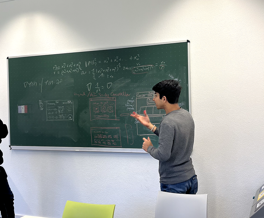
Let's get a developer invovlved?
To bridge the gap between concept and execution, we consulted Professor Karsten Nebe, Head of the Usability Engineering program at Rhine-Waal University, experienced software engineer, and avid AI enthusiast.
The meeting was pivotal in grounding our most ambitious ideas, particularly the Chatbot and Profile Matching System, in technical reality. Professor Nebe helped us navigate backend challenges and explore a more scalable, rule-based system powered by machine learning and NLP, with RASA as a potential framework.
The Chatbot would start with predefined responses and evolve through use, while CV-based data extraction offered a privacy-conscious alternative to transcript uploads.
These insights shaped a realistic and responsible development roadmap that is smart, scalable, and student-first.

and finalize the Information Architecture.
Before jumping into high-fidelity design, we created an information architecture (IA) diagram to map out the platform’s core structure. This helped us visualize key user flows, organize content, and ensure the navigation would be intuitive. The IA served as a blueprint for aligning design decisions across the team.

Phase 4: Design System, Hi-Fidelity, and Prototyping
Color: The Power of Blue
Glint's visual identity uses a monochrome blue palette to convey clarity, trust, and exploration. Blue symbolizes depth and stability, aligning with Glint's mission to guide users in their academic and professional journeys. The minimalist design enhances navigation and keeps the focus on user growth.

Typography and Font
We chose Lato as Glint's primary typeface for its modern, clean look and high readability. Its subtle curves and strong strokes align with our sleek, user-friendly design, enhancing the platform's contemporary aesthetic.

Iconography
Icons in Glint were designed to be clear, minimal, and instantly recognizable, supporting seamless navigation and reducing cognitive load. We used outlined icons from Phosphor Icons, alongside Material Design principles, to maintain a clean, modern aesthetic. This combination ensures consistency, visual clarity, and intuitive interaction throughout the platform.
Phosphor Icons: https://phosphoricons.com/
Phosphor Icons: https://phosphoricons.com/

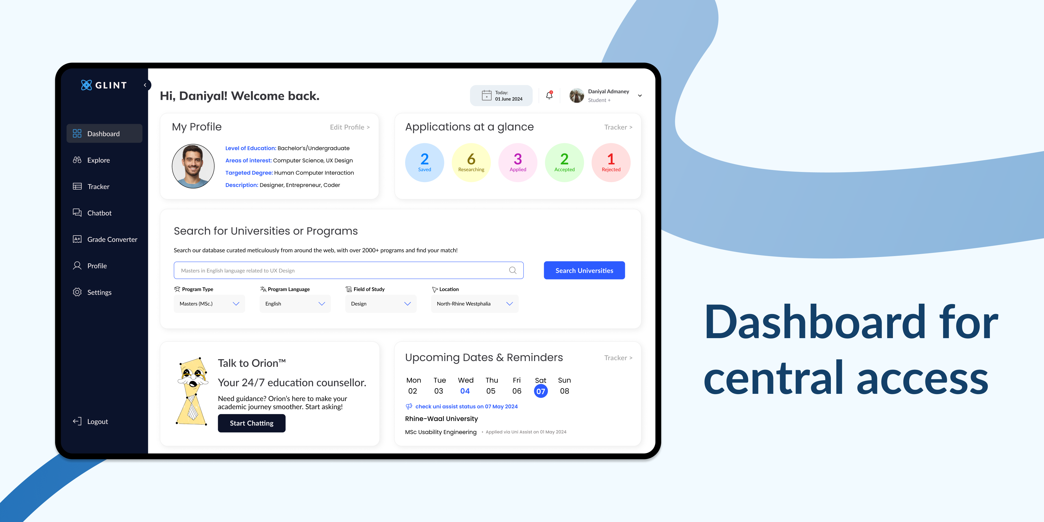
Enough talk. Let's move on to High-Fidelity Design.
The high-fidelity designs brought our vision to life, showcasing a sleek, modern interface that emphasized user-centric navigation and engagement. Each design decision was made with the user in mind, ensuring that the platform was not only visually appealing but also functional and easy to use.


Click through the Figma prototype:
Explore the fully interactive Figma prototype, complete with micro animations and dynamic text fields. This prototype allows you to experience the platform's features firsthand.
Hint: click anywhere on the screen to see blue hotspots indicating interactable elements, guiding you through the user journey.
Hint: click anywhere on the screen to see blue hotspots indicating interactable elements, guiding you through the user journey.
Phase 5: Let's test it again...
and gain quantitive and qualitive insights on the platform's usability.
To ensure Glint delivered an intuitive and student-friendly experience, we conducted comprehensive usability testing using both Maze (remote, quantitative) and think-aloud sessions (in-person, qualitative).
We tested with 30 students from diverse backgrounds, focusing on how easily users could complete key tasks like onboarding, using the chatbot, and navigating program recommendations. Maze provided behavioral data through heatmaps, click maps, misclick analysis, and task success rates. It helped us identify where users struggled, what they focused on, and how efficiently they completed tasks. Meanwhile, think-aloud testing gave us real-time insight into users' thoughts, frustrations, and emotional reactions, validating or challenging assumptions made during design.
We tested with 30 students from diverse backgrounds, focusing on how easily users could complete key tasks like onboarding, using the chatbot, and navigating program recommendations. Maze provided behavioral data through heatmaps, click maps, misclick analysis, and task success rates. It helped us identify where users struggled, what they focused on, and how efficiently they completed tasks. Meanwhile, think-aloud testing gave us real-time insight into users' thoughts, frustrations, and emotional reactions, validating or challenging assumptions made during design.


Combining both methods gave us a holistic view, balancing what users did with why they did it. This dual approach allowed us to refine navigation flows, clarify interactions, and ensure that features like the chatbot and tracker were both functional and user-centric.
What did we learn from this testing and improve upon?
Our usability testing surfaced critical opportunities to enhance clarity, streamline interactions, and improve overall user satisfaction across Glint.
For Signup and Login, we introduced social login options like Google and LinkedIn to simplify registration. We also removed redundant steps by directly redirecting users to the dashboard post-signup. Iconography was added to input fields, and a password visibility toggle was introduced to improve form usability.
In the Chatbot, responses were shortened and restructured using bullet points and tables to avoid overwhelming users. We improved its visibility on the interface and enabled dynamic actions within conversations, such as adding universities to the tracker at any point. This made the chatbot feel more integrated and supportive.
To improve Navigation and UI, we focused on reducing clutter and prioritizing core actions. Buttons were enhanced with icons for better clarity, and users can now select programs directly instead of clicking through multiple layers. Navigational flow was made more intuitive, especially when moving between program exploration and the tracker.
Enhancements in Filters and Search ensured that recommendations aligned more closely with user-defined criteria. We made it easier to return to filtered results without distraction, improving search relevance and user control.
In terms of Deadlines and Requirements, we added precise application dates, clarified language proficiency needs (like IELTS), and integrated a Google Calendar sync for deadline tracking. This is accessible directly from the tracker.
For Profile and Course Selection, we implemented dynamic question logic to tailor follow-up options based on previous responses, speeding up user decision-making. The Profile section was repositioned within settings for quicker access.
Lastly, Dashboard and Tracker Improvements focused on decluttering the layout and organizing key sections more effectively. Visual consistency was enhanced, redundant text removed, and cards like “My Applications,” “Chat with AI,” and “Upcoming Reminders” were reordered for better flow and focus.
Iterating on designs based on usability testing feedback:


