A UX Case Study
How might we make it easier for users to find, track and understand complex data?
Project Roles
UI/UX Design
App Structuring
UX Research
Prototyping
What's the MixRank Platform?
MixRank is a powerful platform designed to provide the most up-to-date data on individuals, companies, and emerging technology trends, processing petabytes of data within seconds. It offers users a seamless experience through its intuitive interface, allowing for quick and easy access to valuable insights. Whether you're a sales professional looking to enhance your outreach or a business strategist aiming to stay ahead of market trends, MixRank equips you with the tools needed to make informed decisions.
Quickly jump to:
Why did we require a change in design?
To increase the usability of the product, fix identified UX issues, adhere it to modern design standards and to add/fix requested customer features
On to the fun bits then.

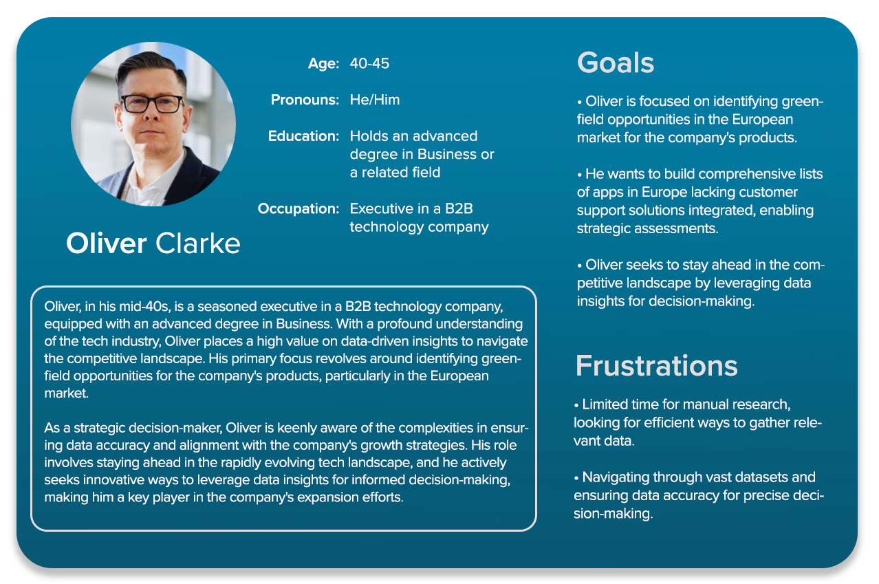
So who's using our product?
To start the user research, I sat down with the Growth team to get a clear picture of what potential customers in the data-driven sales sector are looking for. I also connected with some of our existing customers to learn what they value and where we can enhance their experience. Additionally, I examined industry websites, forums, and social media to pinpoint common issues faced by companies like ours. Using this information, I drafted a user persona to use as a baseline to build from.
What are the others doing?
The industry is huge, and the competition is no joke. But hey, that's a chance to learn and get inspired. I dove deep into what our competitors are doing with their website designs, user interfaces, and how they keep their customers hooked. By spotting their strong points and where they could do better, I found ways to make our website standout and serve a nice experience to the visitors.

.svg.png)


Where I started from:
A couple of snapshots to give you an idea.

Major problems I discovered in the existing website:
1. Lack of content
Sorting through vast datasets can pose challenges for the user. The sheer volume of information can be overwhelming and may hinder efficient decision-making. Users often find themselves sifting through irrelevant data, which can lead to analysis paralysis. This not only affects the speed at which decisions are made but also the accuracy, as critical insights might be overlooked amidst the noise.
2. Outdated user interface
The existing filtering options were not only limited but also unintuitive, making it difficult for users to efficiently sift through the data. This lack of user-friendly filters meant that users often spent more time than necessary trying to locate specific insights, which could lead to frustration and decreased productivity.
3. Difficult to navigate
Navigating through complex datasets requires a balance of precision and simplicity. Users often face challenges in efficiently locating specific information due to the intricate nature of the data. This complexity can lead to frustration, as users may struggle to find the insights they need quickly. To address this, it's crucial to implement easy to use navigation and clear pathways that guide users seamlessly through the data landscape, ensuring they can access the information they need without unnecessary hurdles.
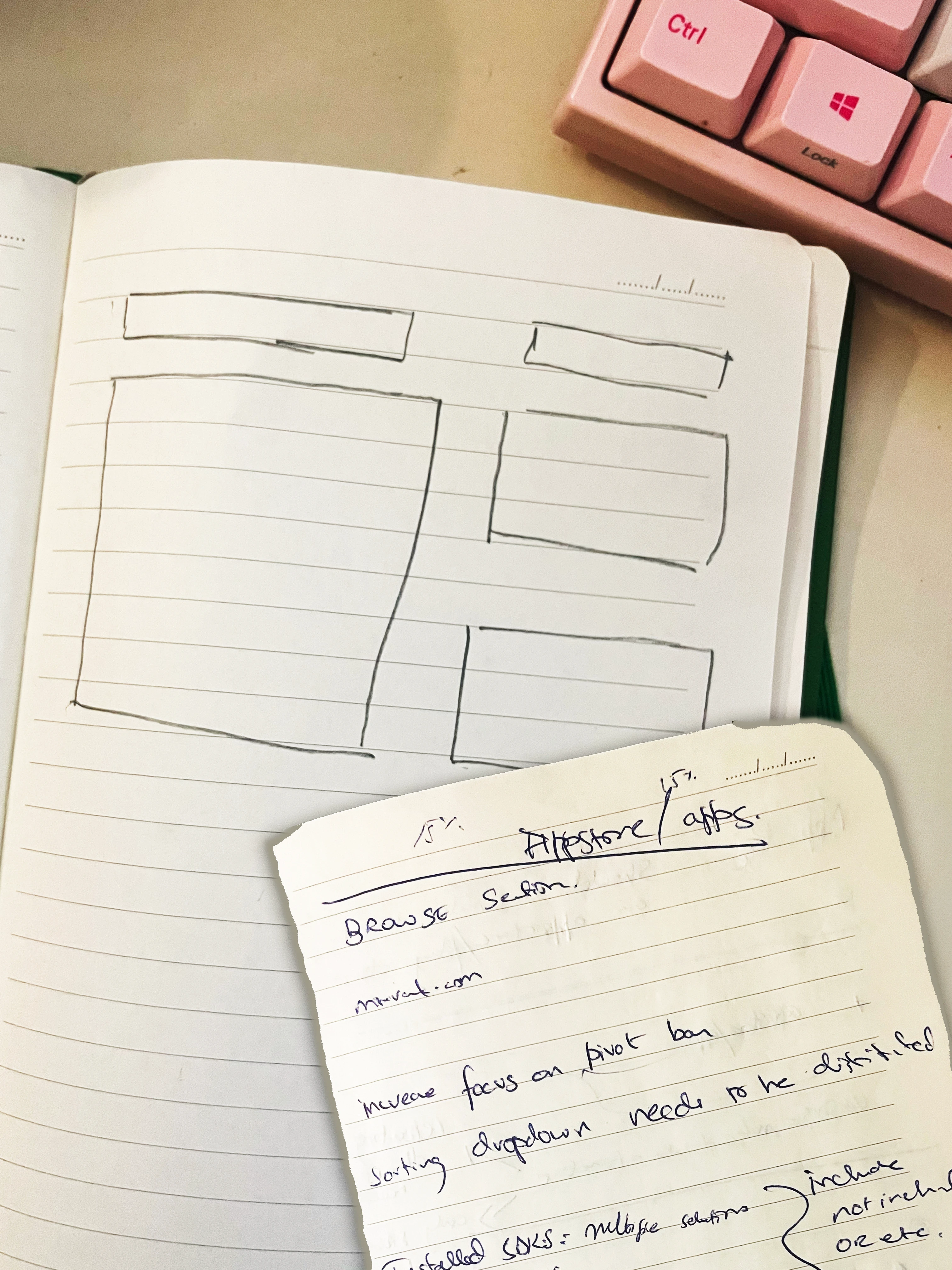
Getting my hands dirty...
The design process kicked off with the initial sketching of paper wireframes, leveraging insights gathered from user research and available information. Building on these foundations, various components were crafted, leading to the creation of a fully functional high fidelity prototype. The rationale behind design decisions will be detailed in the following sections.
.webp)
The Main Question: Cards vs Table
Displaying the required data could have been done in 2 possible ways. Either using a card system, which displays each piece of information in an easy on the design solutions. The other option was to implement a table system, which would structurally display data in a individual cells.
Why not go with cards?
• Too much information needs to be displayed, making it unsuitable to fit into a card
• Users will struggle in reading the data
• Users will have a tough time sorting and filtering through the search results.
• Users will struggle in reading the data
• Users will have a tough time sorting and filtering through the search results.

Table seems better because...
• It's easier to handle and navigate large chunks of data
• All the information is clearly visible on one line for the user
• Customizable column views with quick sorting and filtering system
• All the information is clearly visible on one line for the user
• Customizable column views with quick sorting and filtering system
Let's chat about popups and action boxes. They're a big part of the design here.
The design solution focuses quite a bit on popups. Several functions have a pop up dialogue or action boxes that open up.
While generally, pop ups are notorious for being considered as bad UX, that is for those pop ups that annoy the user and hamper their user experience (usually to serve ads or mailing list subscriptions).
Context matters.
In this design, popups are heavily featured. They:
• Aid the user in implementing search filters
• Do not hamper the user flow - but instead are a part of the user flow
• Do not distract the user.

User Flow Diagram

An executive wants to build a list of all apps in Europe that don't have any customer support solution integrated (to assess the greenfield opportunities in this market).

Clickable Prototype - Phase 1
Attached below is the High Fidelity Clickable Prototype. The following features are prototyped: Hide/Show Filters, Add Filter, Sorting options, Edit/Delete Filter, Customize Table, Select Table Rows, Table Scrolling & Pagination Hover, Country Data Popover & Hint, Advanced Search, Save Search Results, Save Filter Selection.
Hint: click anywhere on the screen and the blue hotspot will show you what's clickable.
For Advanced Search:
Countries > Europe > All
NOT
Technologies Used > Integrated Customer Support
Hint: click anywhere on the screen and the blue hotspot will show you what's clickable.
For Advanced Search:
Countries > Europe > All
NOT
Technologies Used > Integrated Customer Support
That still needed more work. Let's move on to Phase 2.
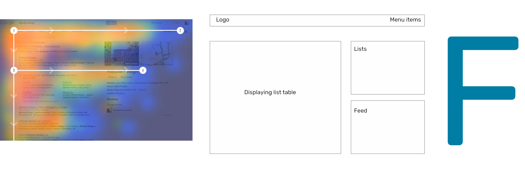
After the initial design, a base for future iterations was set. Next, a revamped home screen was designed, getting rid of the sidebar and shifting the navigation to the top bar. The page structure was also changed, with new features added. I decided to give it an F based structure, to align with existing user mental models regarding scanning and reading content.
Page Structure: F Shaped.
The new homepage structure was designed to be in an F shape to help the user quickly analyze and scan the page for relevant information.
Users first read in a horizontal movement, usually across the upper part of the content area. This eye movement forms the top part of the ‘F.’ Next, they scan a vertical line down the left side of the screen, looking for points of interest in the paragraph’s initial sentences. When they found something interesting they read a line and this eye movement forms a second horizontal line of the ‘F.’ The second line is typically covers a shorter area than the previous movement. Finally, users scan the content’s left side in a vertical movement.
https://uxplanet.org/f-shaped-pattern-for-reading-content-80af79cd3394
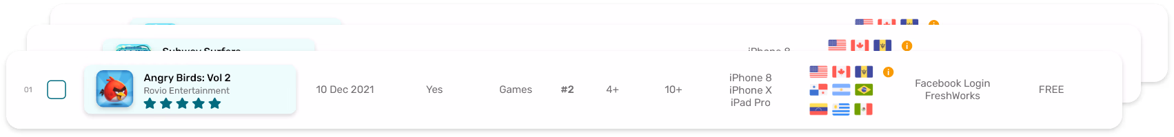
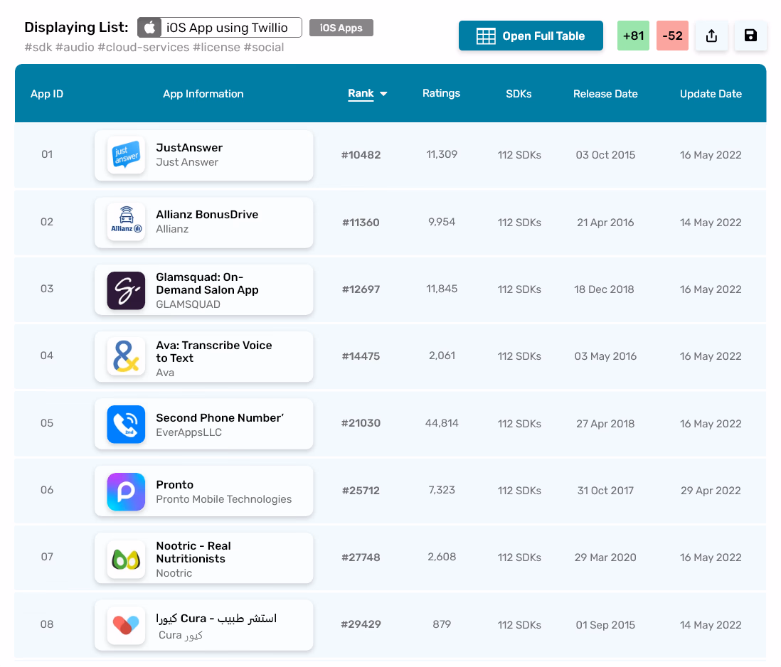
Displaying List Table
Sort of like a preview of the main table of the selected list/search results. The user sees the new installs and uninstalls in the green and red cells on top, along with the existing ability to share and save the list (replaced by edit and delete if it is already saved). Also shows the user the name of the list and the tags associated with it.
The table itself shows important data that user’s would like to see for iOS/Android apps - it will vary for other types of data (The visible columns can be adjusted in the main table). Table is sortable in ascending or descending order by clicking on the relevant column header - as demonstrated in the “Rank” column. The company page would also accessible by clicking on the company name underneath the App name
Users can directly go the the selected list’s main table by clicking on the “Open Full Table” button. The full table will have the filter options as well as more columns and other table operations like editing the column view, pivot, sorting etc.
Note: The table for SDK’s would have the Installs and Uninstalls data clearly visible, a big priority for the user base according to the UX Research.
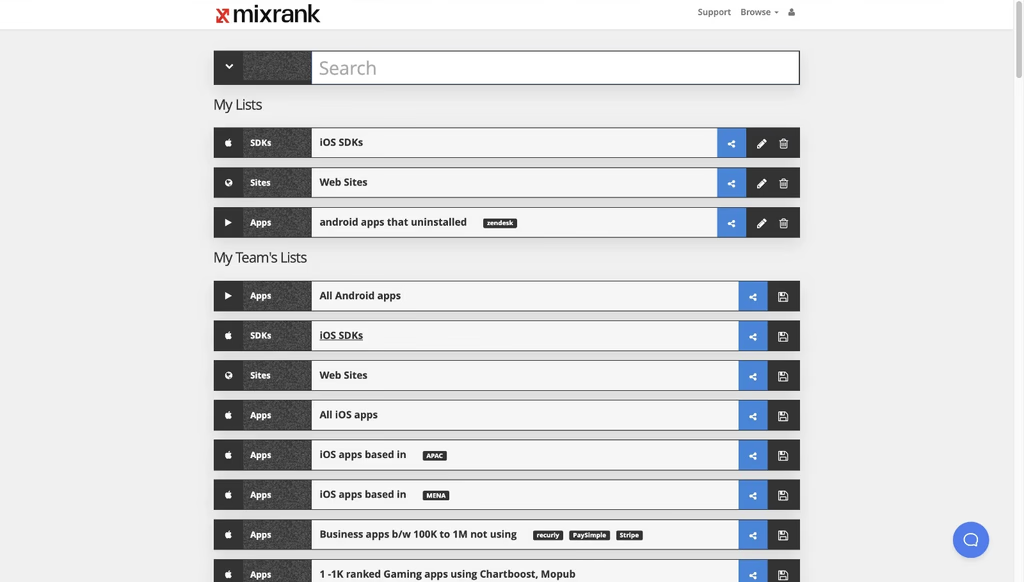
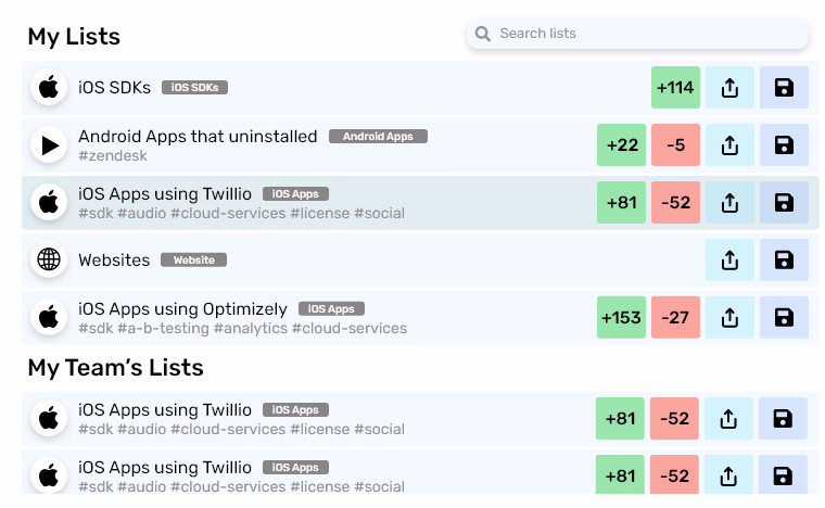
My Lists
Similar to the existing mixrank.com/lists webpage.
Has similar functionality. The user can scroll and click on whichever list they want and it will be displayed in the preview on the left. The list items have hover effect on them, which is also used to indicate the current selected list, as demonstrated by the “iOS Apps using Twillio” list.
The user sees the new installs and uninstalls in the green and red buttons, along with the existing ability to share and save the list (replaced by edit and delete if it is already saved). Also shows the user the name of the list and the tags associated with it, along with relevant platform icons and description.
It can have: My Lists, My Team’s Lists and Public Lists (and any other list we may want to include).
The user can search the accessible lists by the search bar on the top right.
My Feed
A new feature proposed in line with the UX Research conducted on MixRank company personnel.
User’s want to know if the SDK’s they care about have any updates or not. This simple section shows the user the update on the SDK’s they follow by showing the number of total installs, new installs and new uninstalls after each automatic update/manual refresh.
It also suggests SDK’s which the user can follow. Users can follow from right there, by clicking on the plus icon. Users can also unfollow an SDK if they want, by clicking the grey cross icon in the mini SDK card.
Refresh Feed button sends a manual request and updates the feed if for some reason it has not automatically updated with any new activities on followed SDK’s

Clickable Prototype - Phase 2
Attached below is the High Fidelity Prototype. It included initial scroll and hover interactions.
