A UX Case Study
How can a website redesign boost conversions and user engagement?
Project Roles
UX Design
UI Design
UX Research
Developer Handoff
About MixRank.com
MixRank offers a meticulously curated, real-time stream of the latest datasets on people, companies, and technology. With hourly updates, you stay informed about any changes in the data that matter most to you.
The MixRank website plays a crucial role in attracting potential clients, generating leads, offering product demos, and providing comprehensive information about the company.
The MixRank website plays a crucial role in attracting potential clients, generating leads, offering product demos, and providing comprehensive information about the company.
Why did we require a change in design?
The decision to update the website design was motivated by several key factors. Primarily, we aimed to align our platform with modern design standards and our new brand identity, ensuring a seamless and user-friendly experience for our users. Additionally, we sought to improve the quality of leads generated and differentiate ourselves in a competitive market.
Goals and Objectives
The project focused on three main goals: setting itself apart from competitors, improving user experience while maintaining brand consistency, and boosting both the quantity and quality of leads and sales conversions.
On to the fun bits then.

So who's using our website?
To start the user research, I sat down with the Growth team to get a clear picture of what potential customers in the data-driven sales sector are looking for. I also connected with some of our existing customers to learn what they value and where we can enhance their experience. Additionally, I examined industry websites, forums, and social media to pinpoint common issues faced by companies like ours. Using this information, I drafted a user persona to use as a baseline to build from.

What are the others doing?
The industry is huge, and the competition is no joke. But hey, that's a chance to learn and get inspired. I dove deep into what our competitors are doing with their website designs, user interfaces, and how they keep their customers hooked. By spotting their strong points and where they could do better, I found ways to make our website standout and serve a nice experience to the visitors.

Where I started from:
A couple of snapshots to give you an idea.


Major problems I discovered in the existing website:
1. Lack of content
Visitors often left the old site (high bounce rate) feeling a bit let down because it just didn't have enough information to keep them interested. This lack of content meant we missed out on chances to engage with them and make them want to come back.
2. Outdated user interface
The former design felt like a relic from a bygone era. Users found it hard to relate to and, in some cases, even struggled to use it. This outdated design did not only affect its visual appeal but also impacted how user-friendly and trustworthy it appeared to visitors.
3. Difficult to navigate
Moving around the previous website was tough. Users found it hard to figure out where to go and how to get there. This struggle made their experience frustrating and time-consuming, and they might not have accomplished what they came for.
Getting my hands dirty...
Jumping into the design process, I had a ton of ideas for the new responsive website. I narrowed them down to the ones that would align with the Leadership's vision, aiming for a smooth and enjoyable experience. It started of course with some paper wireframing which served as a skeleton, for the digital versions.


Key Question: Dark Theme vs Light Theme?
Our new branding was all about being bold and dark, which was a bit different from the usual light themes everyone else was using. We had a choice to make: stick with our commit wholly to our new look or play it safe. After a discussions and design presentations for darker screens and ligher ones, I managed to get the leadership on board with the darker, theme. I pictured a sleek, modern site with 3D illustrations to really set the vibe.
But, who's making the illustrations?
We collaborated with a freelance illustrator to create personalized 3D isometric illustrations that would enhance the website's aesthetic. I provided them with detailed written prompts outlining our ideas and concepts, which they skillfully brought to life. Through an iterative review process, I offered feedback and suggestions, allowing the illustrator to refine the designs until they perfectly matched my vision.


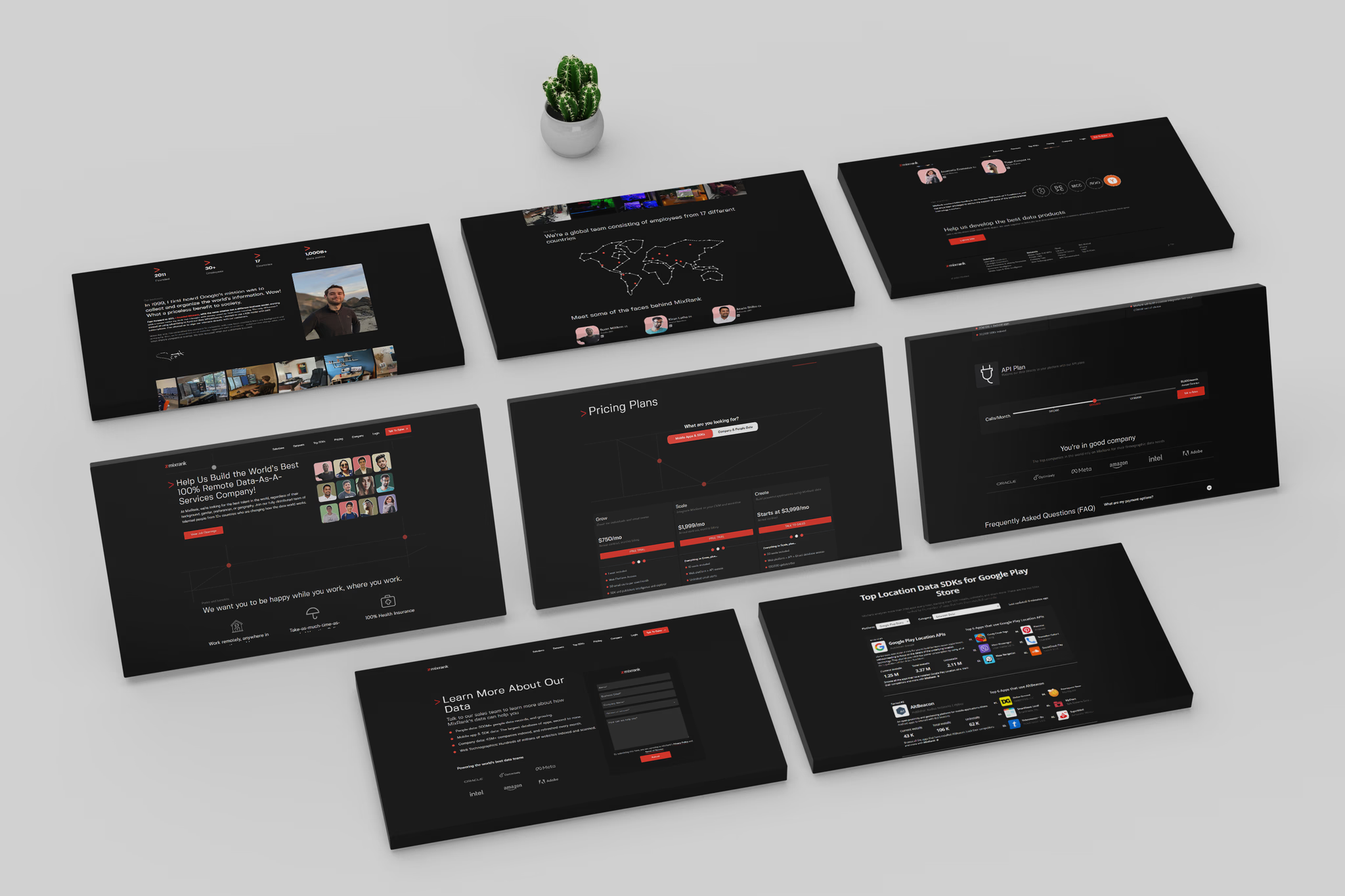
Fun part: Design Showcase 😎

Developer Handoff and Review
We got a developer on board to bring the website to life via WordPress. I handed over all the CSS, assets, and prototype files to kick things off. The developer transalted the designs into a working site, with a weekly review process. I led these reviews, giving clear instructions to make sure everything looked as designed.
You can check out the live site at www.mixrank.com (or see the video preview below).
You can check out the live site at www.mixrank.com (or see the video preview below).
What were the results?
+8%
Avg. Time Spent on Website
+9.5%
User Engagement Rate
+11.5%
Customer Conversions Rate
+9%
Lead quality and quality
+12%
General Web Traffic
-4%
Website Bounce Rate
Custom Made UI Kit
Color Palette
#101010
#EA3022
#706D6A
#A5AEB4
#FFFFFF
Form Elements

Typography
Fivo Sans Modern Bold
Fivo Sans Modern Medium
Fivo Sans Modern Regular
0 1 2 3 4 5 6 7 8 9
Aa Bb Cc Dd Ee Ff Gg Hh Ii Jj Kk Ll Mm Nn Oo Pp Qq Rr Ss Tt Uu Vv Ww Xx Yy Zz
Aa Bb Cc Dd Ee Ff Gg Hh Ii Jj Kk Ll Mm Nn Oo Pp Qq Rr Ss Tt Uu Vv Ww Xx Yy Zz
