Claude Design Just Closed the Loop. No, Figma is not dead.
From a cricket scoring app to a working prototype: in one session, on one platform.
Claude Design dropped on a Friday. Screw you, Anthropic. There goes my Friday night.
Oh who am I kidding. I love it.
I've been skeptical of generative UI tools for a while. Figma Make, Lovable, Stitch - all of them. The promise is always the same: describe what you want, get a design. The reality is the AI slop you see around. Rounded corners, purple gradients, Inter everywhere. Technically fine. Soulless. Also emphasis on tools. The sooner we make peace with the fact that these are just tools that enable us to be efficient and stop being afraid of them - the better.
So when Claude Design dropped today I didn't want to test it on a made-up SaaS dashboard. I wanted to test it on something real. Something with actual constraints.
As a side project, I've been working on Tracket. An an AI enabled mobile cricket scoring app for my amateur team in Germany. One thumb operation. Used outdoors in direct sunlight. The scorer (sometimes me) is also playing in the match. Every component has to earn its place.
What started as "let me kick the tyres on this tool" turned into something bigger. By the end of the night I had gone from a written brief to a working prototype. Not just mockup. But one I could simulate an entire match with and export the match data for the post match analysis.
This is how that happened.
Claude Design
The Onboarding
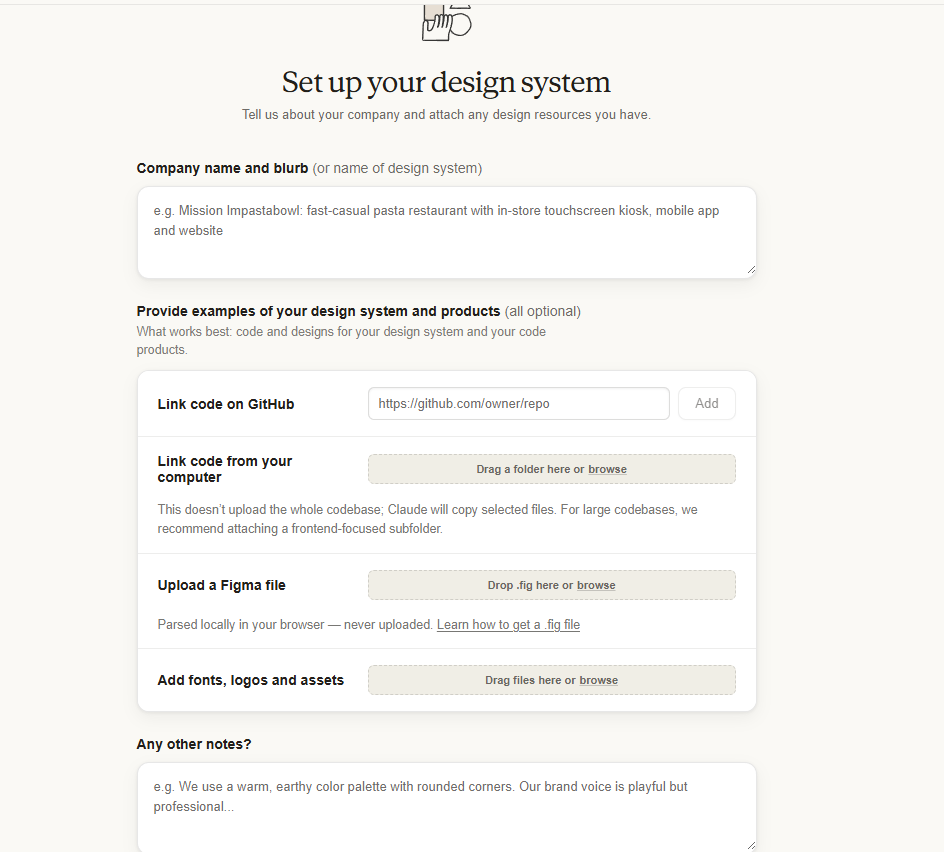
First impression: clean. The onboarding asks for a company name and description, lets you link a GitHub repo, upload a Figma file, and add custom fonts. Curiosly, it had the option to build a design system from scratch, from just a written description. No existing assets required. Why not - let's check.
Worth noting: Claude Design runs on Opus 4.7, Anthropic's most capable model (well, until Mythos rolls around). That matters. It's their best current model doing the design thinking.
I typed out my project context. Described the aesthetic: utilitarian, sports scoreboard, sunlight readable, high contrast, light theme. Dropped in my screen specs. Hit go.
It started building the design system in real time. I could leave comments and fix things while it was still generating. That's not a small detail. That's a workflow shift.
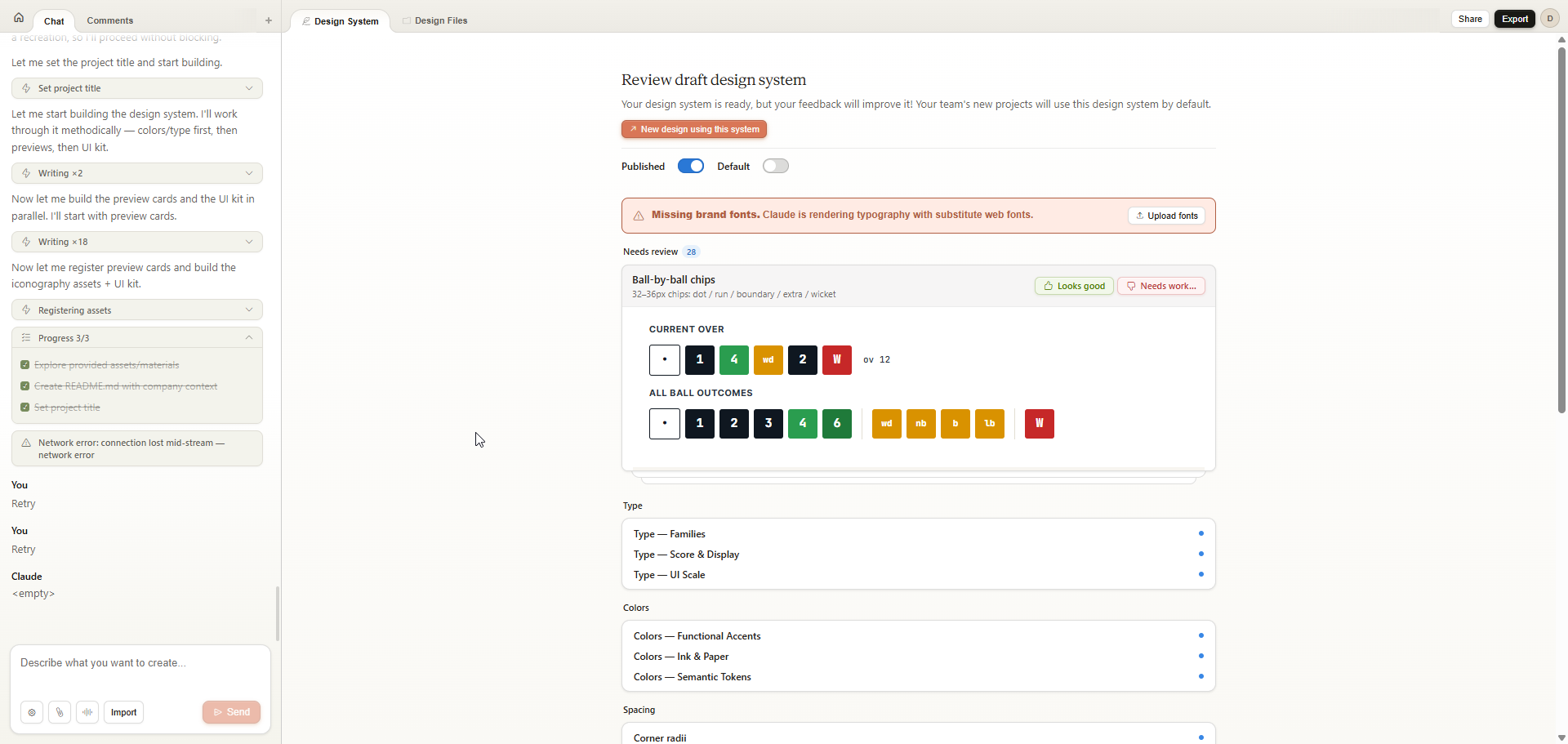
I could see components appearing one by one. Typography, color tokens, button variants, form elements. I reviewed them as they came. The dark scoreboard header showed up and I thought yes, that makes sense, the score zone needs to feel different from the interactive zone below it. I kept it.
The wagon wheel component had issues. The placeholder logo was generic. I flagged both. It fixed them.
It kept nudging me to upload custom fonts, which I appreciated, but I was also deliberately holding back to see what typography it would reach for on its own.
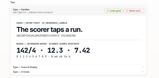
The Typography Call
Inter for body. Of course. You could set a clock by it.
But then: JetBrains Mono for the numerics. Score. Overs. Run rate. Strike rate.
That's not a bad call. JetBrains Mono has a sporty, technical quality to it, especially in the digits. I like how that '4' looks. Naughty behaviour, hmm.
First Output
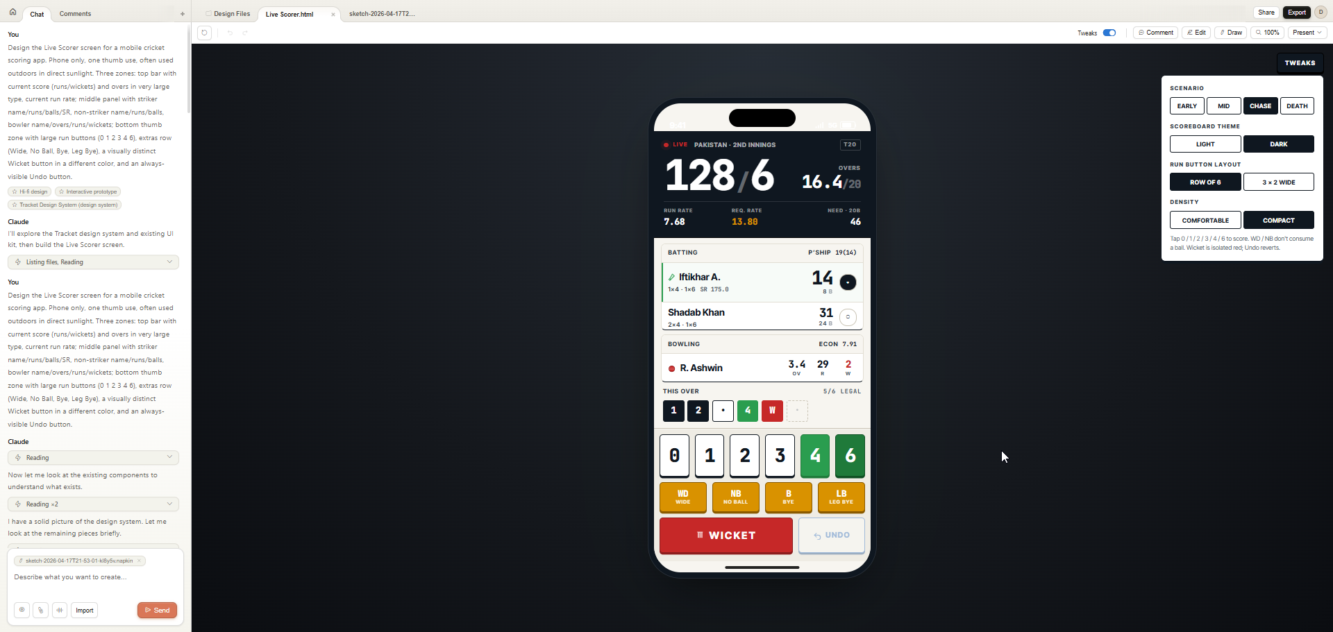
I went to the design tab, started a new file, and typed my first prompt. Told it to build the live scorer screen. The most complex screen in the app. Specified the three zones: scoreboard at the top, current players in the middle, action buttons at the bottom.
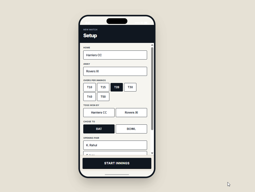
First reaction: oh damn.
For a completely cold first output, this was close. Not perfect. But close. The information hierarchy was right. The zones were clear. The Wicket button was red and isolated exactly as I'd asked. The Undo button was always visible.
Issues I spotted immediately:
- Padding on the non-striker card was inconsistent
- The current batsman icon was wrong
- Spacing between the bottom buttons needed more room, misclicks are a real risk on a phone mid-match
- The radio selector looked off balance
None of these are fatal. All of them are fixable. And some of them were my fault for not specifying clearly enough in the prompt. That's always a given. For any natural language based tool. Be as specific as possible.
Tweaks
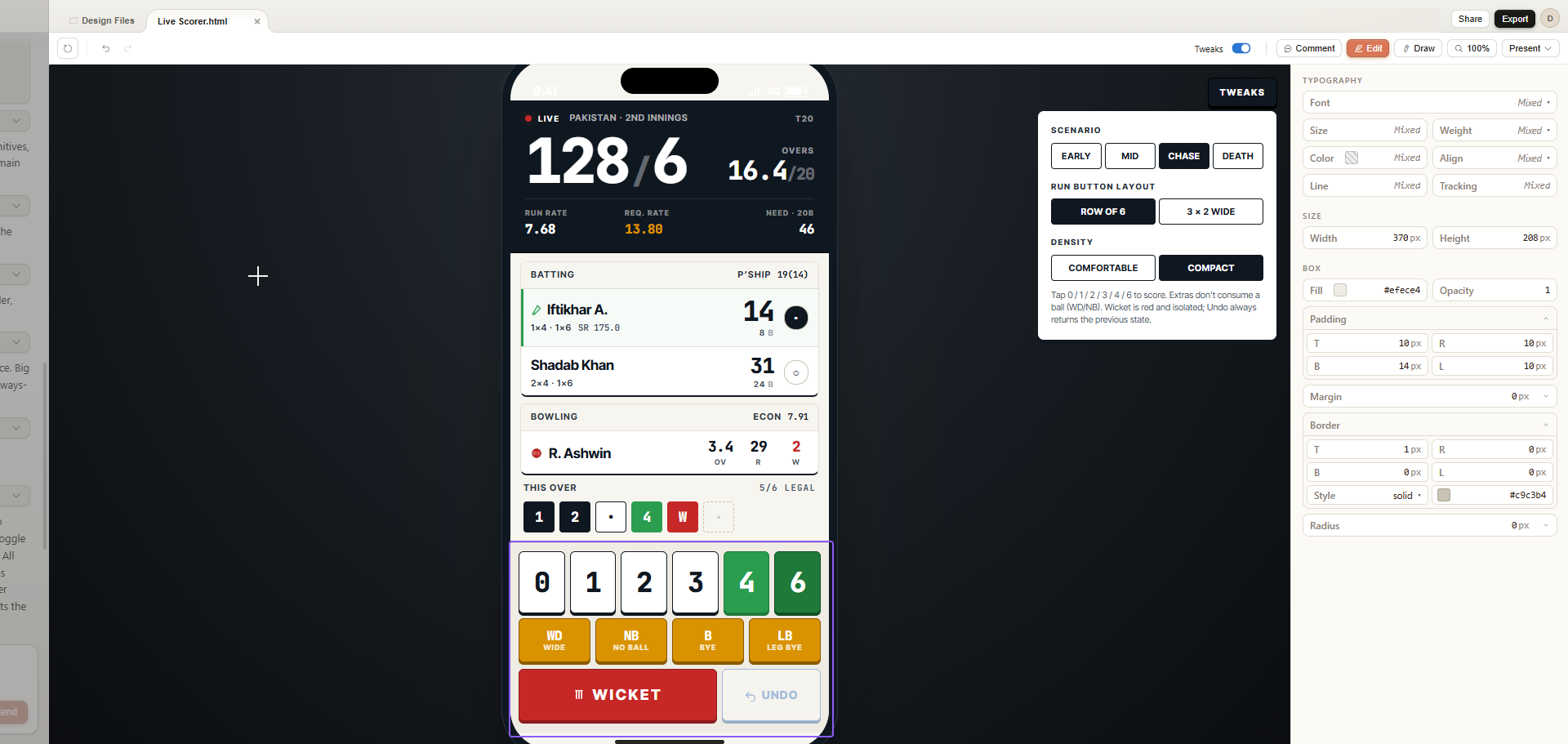
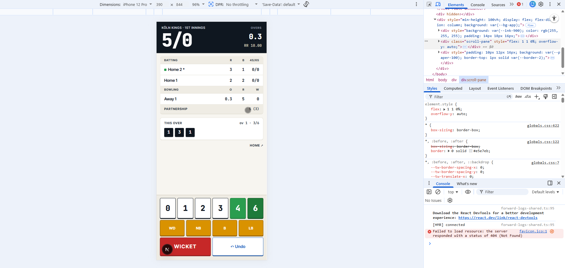
Ok now this is fancy.
Claude Design automatically generated a Tweaks panel for my design. Not a set of variants I asked for, a set of contextual scenarios it inferred from the brief. Early innings. Mid innings. Chase. Death overs. Light scoreboard vs dark. Row of 6 buttons vs 3x2 grid. Comfortable density vs compact.
I didn't ask for any of this. It just thought about the use case and built them.
The practical value goes beyond aesthetics. This is edge case testing. What does the layout look like when the score is 187/9 in the 19th over? What happens to the button spacing at compact density? I can check all of this without writing a single additional prompt.
The 3x2 button layout is too big by the way. Row of 6 is the right call, it also maps to the mental model of 6 deliveries in an over. But the fact that it offered both without being asked is the point.
It also didn't account for edge case run scenarios, 5 runs from an overthrow, 7 from a penalty. Real cricket situations. But I didn't mention them in my prompt either, so, like I said, be as specific as possible. Or just iterate.
Direct Editing
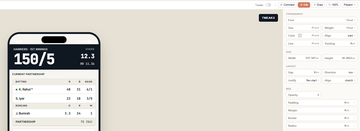
There's an Edit tab. You can go directly into the design and adjust things yourself. Spacing, sizing, layout, all editable inline without going back to the chat.
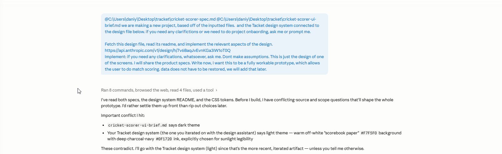
I fixed the button spacing manually in a minute. Then used the comment to chat feature for the non-striker card. I could see from inspecting the element that the parent container wasn't hugging the card correctly. I highlighted that particualr component and described what I thought the issue was. It fixed it. Refresh. Done. Woo.
Wait. This Is Bigger Than Screens.
I keep saying "this was just a quick test." And it was. One screen. One session. But while I was in there I started poking around at what else it could do.
Animations. As someone who loves interaction design, I am floored. The level of motion and micro-interaction you can generate and prototype here is not what I expected from a tool that's still in a research preview. Now we can have fun with animations.
And presentations. Holy shit. If it applies the same design intelligence to decks that it applies to screens, presentation design is about to get completely rethought. Not Canva templates. Actually considered, on-brand, design-led presentations.
Oh it definitely has the potential.
The Wall
Then I hit the usage limit. Mid-session. No warning before it happened.
This is a research preview, so some friction is expected. But a week lockout with no heads-up as you're working is a real problem. I was about to go wild and now I'm locked out until next Friday.
To be clear: this isn't a complaint about the tool's quality. It's about the UX around limits.
I was about to log off and write this, but then I thought: I already have the design file. The full rendered scorer screen, the Tracket DS README, the component tokens, everything. Can I just hand it to Claude Code?
Reader, I could.
Claude Code
The Handoff
I opened Claude Code. Gave it three things: the design file URL from Claude Design, my pre-prared product specs and UI brief. One instruction: build me a working prototype of the Live Scorer screen.
It didn't write a line of code. It read both specs, the design system README, the CSS tokens. Then it came back with six clarifying questions.
One of them was a conflict I'd created myself. Earlier in the day, before I fully cleaned up my brief, the UI spec still said "dark theme" from an old version. The Tracket DS it was reading said light theme, warm off-white paper. It caught the contradiction. Made a judgment call (go with the newer Tracket DS). Asked me to confirm. Cool, thanks Claude.
It also asked about tech stack, scope, shot zone cadence, undo depth, player entry validation, project location. Senior engineer kinda questions. It locked in my answers, summarised them back to me, and started building.
The Build
Nine minutes. Twenty-five thousand tokens. Full app skeleton.
Tappable buttons. Great, I expect that by now. The shot zone appeared after every legal delivery. The wicket modal opened. The over ticked over after 6 balls. The scorecard updated. Undo reverted the last ball.
Was it perfect? No. The batter/bowler card layout didn't match the design. The fonts on the extras buttons were wrong. The wagon wheel was off balance. But the core loop worked.
The Iteration
I called out the card layout: "the cards for the center scorecard are not consistent with the design. refer to the design link and the screenshot."
Claude Code looked at both, identified the gap, and rebuilt the batter rows to match. Bigger run numbers, stacked ball counts, green dot for striker, grey for non-striker. Separate run/ball display. Pill-shaped boxes for bowling stats.
Then I noticed the fonts on the action grid were Inter, not JetBrains Mono. Ofcourse. Flagged it. Fixed.
The Domain Knowledge Moment
This is the interaction I want to highlight most from the whole session.
I noticed some UX issues in the wagon wheel and wicket modals, and match setup flow. Long lists of buttons. Too much scrolling. Needed to replace list of buttons with a dropdown selector. In the match setup, I told it to hide the creation of the team sheet behind another modal, adding inline messaging to inform the user to complete their squad.
Then came the wagon wheel correction and this is where it got interesting.
The wagon wheel it had built was wrong. Not visually wrong, conceptually wrong. It was oriented from the batsman's perspective facing the bowler, but labelled as if from the bowler's end. It also had the left and right hand batsman field positions flipped.
I gave it the correction in full: bowler and umpire at the bottom, batsman at the top. For a left hand batsman going clockwise on the off side: third man, point, cover point, cover, mid off. Then straight. Then the leg side: mid on, mid wicket, square leg, deep square leg, fine leg, long stop, slip cordon. Flipped for right handers.
This is cricket-specific domain knowledge that isn't in any design brief. It came from me. From playing the game and knowing what a scorer actually looks at.
And that's the point. The tool built the structure. I brought the knowledge. Neither of us could have done this alone at this speed.
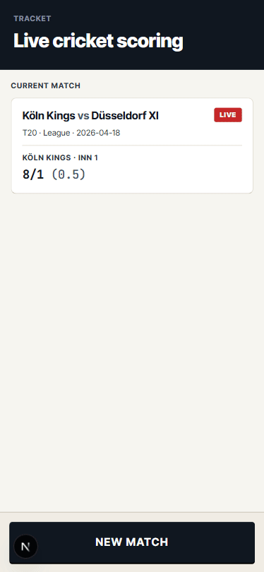
The working prototype is now live at tracket-one.vercel.app. It is a web app based on Next.js, to be used on a mobile device.
The Bigger Point
Like, Claude Code was missing the visual layer. It's not anymore.
Code? Covered. Reasoning? Covered. Agentic workflows? Covered. But when it came to design, to the visual side of what designers and product people actually do every day, there was a gap.
Claude Design closes that gap. And the moment it does, the entire pipeline, written spec, design system, visual design, working code, are connected inside one ecosystem. I went from brief to prototype on one platform today. That wasn't possible yesterday.
This is Anthropic closing the loop.
Claude Design is not a full-featured design tool. Figma isn't dead, not really. The precision, the component management, the collaboration workflows, the plugin ecosystem, none of that is here yet. Claude Design is a powerful starting point and a rapid iteration layer. It is not a replacement for a mature design environment, at least not today.
And then there's the token problem. This is the one that should give you pause before you go all in. Generative UI is hungry. Every prompt, every iteration, every comment, every Tweak you explore burns tokens. I hit my entire weekly Claude Design quota in one evening. One evening. And when you hit the wall, you stop. Your productivity is now determined by your token limits, not your ideas or your time. If you're deep in a project and the quota resets in six days, you wait six days.
Scale that to a team. Scale it to a real production design workflow. The bills could get crazy fast. And the question becomes genuinely worth asking: is the speed worth the cost? For exploration and prototyping, probably yes. As a primary design tool at scale, that's a harder sell right now.
It's still rough. Claude Design is research preview. Some queries in the design chat return empty results. The design bundle endpoint dropped mid-session during handoff. The usage UX is not where it needs to be.
But the pipeline works. On day one. On a real project with real constraints. On a Friday night when I wasn't planning to ship anything.
I'll be back next week to finish Tracket. The rest of the screens, the polish, the bits that didn't quite match. The point isn't whether my cricket scoring app ships on time. It's that the tools needed to ship it are now all in one place, from one company, talking to each other.
That's the scoop. Not a new design tool. A closed loop. A rough, expensive, and occassionaly breaking yet exciting closed loop.