How I Built My Portfolio With Figma, Claude, and a Lot of Back-and-Forth
A designer, an AI, and a Figma file that held it all together.
The Honest Starting Point
I'm a product/UX designer. I also have a BSc in Information Systems, and my first couple of jobs had me doing front-end development alongside the design work. So I'm not starting from zero. I know how the web works. I understand what TypeScript is complaining about. I can open VS Code, read a component, and figure out why something looks wrong.
What I hadn't done in a while was write a full codebase from scratch. The understanding was there, the muscle memory wasn't. And Claude Code wrote the vast majority of the actual code in this project. That's just true. But the technical foundation meant I wasn't flying blind. When something was off, I could open inspect element, track down the problem, and either fix it myself or explain it precisely enough that Claude Code could fix it properly.
That combination (Claude Code writing the code, me understanding it well enough to verify and correct it) is actually what made this work. Handing off to an AI and checking nothing isn't a workflow, it's a gamble.
I also refused to use a template.
Portfolio templates are fine. They're just not mine. I had a certain design vision for the portfolio, and I didn't want to use Framer or Webflow anymore. I had always wanted to do this: have my portfolio self hosted, properly built out.
So I designed the whole thing in Figma first. Then I figured out how to actually build it.
The Stack I Landed On
After some research and a few conversations with Claude about what made sense for a portfolio like this, I landed on:
- FrameworkNext.js with TypeScript
- StylesTailwind CSS v4 (with design tokens defined in
globals.cssvia@theme) - AnimationFramer Motion for animations
- TypographySelf-hosted fonts because I needed full control over variable font axes
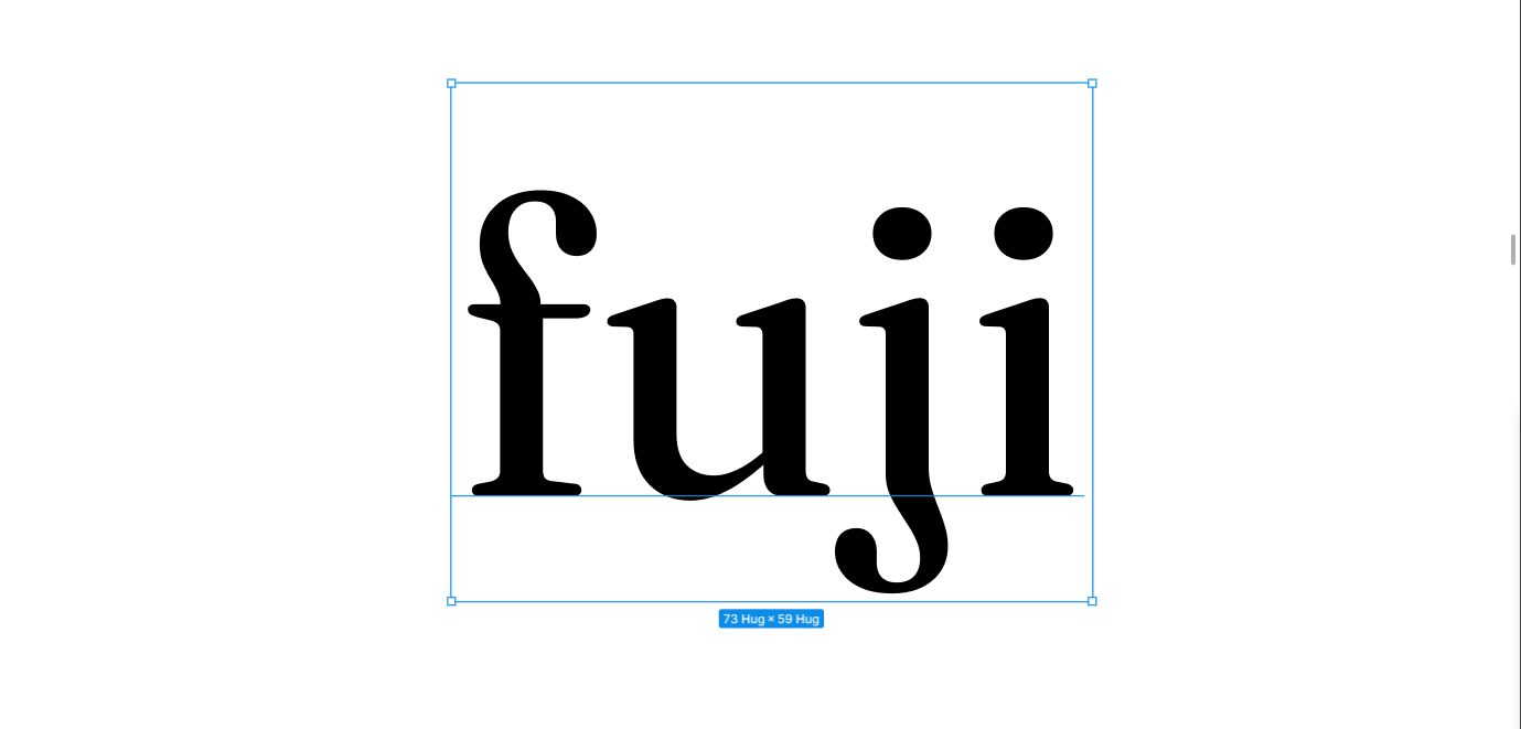
The last one matters more than it sounds. I'd chosen Fraunces as a display typeface specifically for its WONK axis, a variation axis that gives the characters a hand-drawn, slightly quirky quality. Google Fonts strips custom axes. next/font does too. The only way to get the letterforms I'd designed around was to host the TTF files myself and write the @font-face rules manually.
That detail took a whole debugging session to figure out. But when it finally worked, the `j` in the intro section looked exactly like it was supposed to. Worth it.
The other fonts: Neue Haas Grotesk Display Pro for body and UI text for that editorial look, Martian Mono for labels, metadata, and anything that needed to feel precise and technical.
The Design Direction: Journal Meets Editorial
Most portfolios do one of two things. They either list projects like a CV with screenshots, or they go full agency-portfolio mode: dark background, dramatic typography, everything optimised to look impressive at a glance.
I didn't want either.
The structure of a traditional portfolio made sense to keep. Navigable. Chronological work, clear roles, visible impact. That's what people come to read and I wasn't going to make them hunt for it. But the way it felt, the voice of it, that had to be mine.
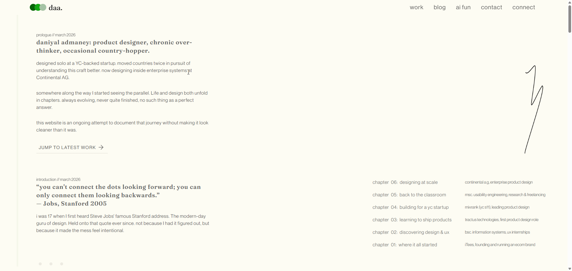
The concept I kept coming back to was: a portfolio that reads like a journal. Not a journal in the sense of raw and unfinished, but personal. With a voice behind it.
The editorial direction came from wanting it to have weight. Typography was essential. Generous white space. A cream background instead of pure white because pure white feels clinical. A single green accent used sparingly. The overall feeling should be considered, not loud.
The journal direction came from everything else. The photo captions ("wdym i gotta code?", "cant score past me", "some conference // 2016"). The writing that doesn't pretend the messy bits didn't happen. The polaroid-style picture frames with tape. The messy writing.
The theme connecting everything was dots. Specifically, connecting them. The Jobs quote from Stanford: "you can't connect the dots looking forward, you can only connect them looking backwards" is the actual spine of the portfolio. Each chapter is a dot. The whole site is the line between them.
The ChapterNav sidebar wasn't just a navigation convenience. It was the theme made literal: a vertical line with dots at each chapter, the active one highlighted in green, the line growing as you scroll down through the story. It literally connects the dots as you go. Subtle enough that most people won't consciously register it. But it's there.
I also made a deliberate decision to write every word myself. No AI-generated copy anywhere on the homepage. The whole point of the journal vibe is that it sounds like a real person. The moment it starts sounding like AI slop is when it breaks the spell.
This was also my first serious project with Claude Code, and that shaped some decisions. I kept the design relatively contained: clean layouts, clear component boundaries, nothing too experimental. Not because I didn't want to push it, but because I needed it to build correctly first. The foundation had to be solid. Now that I'm more comfortable with the workflow, the next version will probably be less restrained. Stay tuned.
The Workflow: Figma + Claude Code + Claude Chat
I used two modes of Claude throughout this project:
Claude Sonnet 4.6 for planning, design decisions, reading the Figma file via MCP, generating component prompts, and reviewing what was being built. This is where I'd come to think out loud, get a second opinion on a layout decision, or ask "what the hell is happening with this font."
Claude Code is the CLI tool that runs in your project directory. This is where the actual code got written. I'd paste prompts into it, Claude would read my Figma file directly via MCP, and then write the component. I'd check localhost:3000 (eventually hosted via Vercel), come back to chat, iterate, generate the next prompt, paste it into Code, repeat.
The rhythm was: Claude chat for thinking, Claude Code for building. The Figma MCP connected both of them to the source of truth.
How the Figma MCP Actually Changed Things
Now this was the main thing. The main backbone.
Without the MCP, you'd describe your design to Claude and it would approximate. With the MCP, Claude can read the actual Figma file: the exact node, the exact values, the exact spacing, the component variants, the color variables. For every component I built, I'd share the Figma node URL and Claude could inspect it directly.
It wasn't perfect. Claude can read the design data but not always infer intent perfectly. Sometimes a layout decision that's obvious when you're looking at the Figma file needs context about why it's that way. So there was still a real back-and-forth. But it removed an enormous amount of friction from the "describe what you see" phase of the process.
Designing the Figma File for the MCP
Before Claude Code could build anything, the Figma file had to be ready for it. And "ready" means something specific when you're working with the MCP.
The MCP reads your Figma file literally. It reads layer names, component names, variable names, auto layout structure. If your layers are called Rectangle 47 and Group 12, that's what Claude gets. If your tokens are called green instead of color-brand-primary, it'll hardcode hex values into your components because it has no intent to read. Garbage in, garbage out.
So the file had to be built properly from the start.
Every layer got a meaningful name. Not frame-3 but col-1, row-2, body-text, chapter-link-label. Things that communicate structure. Component layers were named after what they actually were: navbar-tab, chapter-section, picture-frame, project-card. When Claude Code read a node and saw col-1 inside hero-section, it could infer a two-column layout. If it had seen Rectangle 47 it wouldn't have inferred anything.
Components were built from scratch and nested properly. Small atoms first: the tag, the dot, the tab. Then molecules: the chapter link, the column header, the project card. Then organisms: the full chapter section composing all of the above. Same bottom-up logic you'd use in any component-driven codebase, applied in Figma first.
Color and text styles were set up as proper design tokens. Every color referenced a style (DAA/Green, page-background, body-text) rather than a raw hex value. Every text style had a name that described its role, not its appearance. This is what allowed Claude Code to output components using CSS variables rather than hardcoded values.
Auto layout was used throughout of course. Auto layout in Figma maps almost directly to flexbox in CSS, Claude Code could read a frame's auto layout properties and produce the right flex direction, gap, padding, and alignment without me having to spell it all out in the prompt.
One more thing: give Claude Code the link to a specific variant inside a component, not the component set as a whole. When I'd share the exact node for the mobile variant of a component, the output was sharper than when I'd share the parent and ask it to figure out the responsive behaviour itself. The more specific the link, the less it has to guess.
Building Component by Component in code
The approach was simple: one component at a time, never skip ahead.
I built the Typescript components in this order, transferring context from the relevant Figma node:
- Design tokens (colors, type scale, spacing) in
globals.css - Navbar: desktop right-aligned layout, then mobile hamburger overlay
- HeroSection: two columns, decorative arrow SVG, CTA
- IntroductionSection: the chapter index with a quote block on the left
- PageBreak: the simple three-dot divider between chapters
- ColumnHeader: the chapter header with logo, eyebrow, title, and role/location
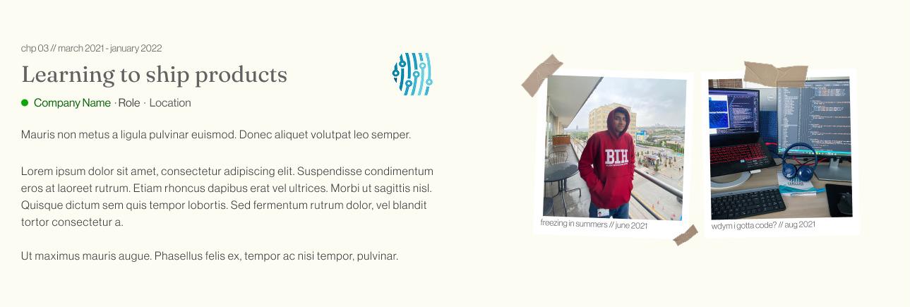
- PictureFrame: polaroid-style photo cards with tape effects
- ProjectCard: the work preview with browser bar mockup
- ChapterSection: the main container composing all of the above
- ChapterNav: the floating sidebar navigation widget
Every component was built for four breakpoints: 390px, 768px, 1280px, and 1440px. Four Figma frames per component, four sets of values to read and translate. The responsiveness wasn't an afterthought. It was baked into each prompt from the start.
The ChapterNav Story
This one deserves its own paragraph because it's my favourite part of the site.
I wanted a floating navigation widget on the left side of the screen that would track which chapter you were currently reading and highlight it. Minimal navigation, that also ties in with the overall story arc.
I hadn't designed it in Figma. I just had the idea while building and wanted to think it through before committing.
So I asked Claude chat to prototype two versions: one with dots only (labels on hover), one with always-visible labels beside each dot. Two interactive widgets, side by side, right in the chat, so I could compare them before touching any code. I could click through them, try the interactions, get a feel for it.
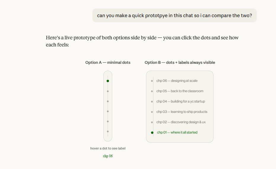
I picked the minimal dots version. Then asked for a third iteration: dots only, but labels slide in from the right on hover instead of appearing below. That became the design. Then I got the Claude Code prompt to actually build it.
The whole process (idea, comparison, iteration, decision, code) happened in a single conversation without opening Figma or writing a line of code myself. Now that's cool.
The implementation used IntersectionObserver to detect which chapter was in view, Framer Motion to animate the active green line growing down toward the current dot, and slide-in labels that appear on hover. Hidden on mobile, obviously. There's no room for it (but I might have an update on that in the works).
The ContiConnect Case Study Page
After the homepage was working, I moved to the first case study page, the one for ContiConnect, a fleet management portal I worked on.
This was more complex. A sticky sidebar navigation. Nine content sections. A full hero split with metadata. Study metrics cards. Before/after comparison layouts. Four breakpoints for everything, again.
I designed all of it in Figma first: every breakpoint, every section, every component variant. Then I wrote out a complete CLAUDE.md-style build document specifying the file structure, component names, Figma node IDs for every component at every breakpoint, and the layout rules for the sticky sidebar system.
That document went into Claude Code as a master brief. Then we built section by section.
What Surprised Me
Claude Code gets things wrong, and you need to know enough to catch it
There were prompts which would not fully map to the design. Wrong spacing. Wrong font weight. Layouts breaking when checking for responsiveness. I'd open inspect element, track down what was actually happening, and either fix it directly in VS Code myself or diagnose it precisely enough that the next prompt actually resolved it rather than creating a new problem.
How useful prototyping in chat actually is
Before this project I'd never thought to build interactive prototypes directly in Claude chat to make design decisions. Now I'm insanely curious about the possibilities.
Font axes are apparently a whole thing
I spent a surprising amount of time on Fraunces's WONK axis. No regrets.
Context is everything with Claude Code
Vague prompts got vague components. When I'd come to chat first, think through the design, read the Figma node, and write a detailed prompt, the output was close to the Figma spec on the first try. The quality of what you get is almost entirely determined by the quality of what you put in.
What I'd Do Differently
I'd write the CLAUDE.md file from the start. Claude Code has a feature where you can put persistent instructions in a CLAUDE.md file in your project root: coding conventions, design tokens, rules like "never use hardcoded hex values." I only discovered this partway through. Components built before it were less consistent than ones after.
I'd also be less precious about starting the case study content early. I kept telling myself I'd write it later, when the design was more stable. But the writing shapes the design. Once I had real copy in the case study sections, I made better decisions about spacing and layout. Do it earlier.
The Actual Takeaway
A designer who hadn't written a full codebase in years shipped a production Next.js portfolio: four responsive breakpoints, custom variable fonts, Framer Motion animations, a handcrafted case study system, in a couple weeks of evenings.
Claude Code wrote most of the code. That's true and I'm not going to pretend otherwise. But I understood what it was writing. I caught its mistakes. I fixed things directly when it got it wrong. I made every design and architectural decision. I wrote the Figma design it was building from.
The main takeaway of this isn't "AI built my portfolio." It's "I built my portfolio, and AI handled the parts that would have taken me ten times longer." It's just another tool. No need to be scared of it.
That said, currently, I'd still be wary of using it for actual intesive product development from scratch. Security concerns are real. But for a static website? Lezzgooo. The barrier to building isn't whether you can code. It's whether you understand enough to be in the loop. Design instinct plus technical literacy, the ability to open inspect element and actually know what you're looking at. That's what makes the collaboration work.
Claude handled the parts I was slow at. I handled the parts Claude couldn't feel.